Visual identity for Re:publica rebels against digital culture with reams of text

architecture and design / dezeen
Autor: dezeen Publicado el: 09/08/2019
Visual identity for Re:publica rebels against digital culture with reams of text

Fertig Design has created a visual identity for the Re:publica conference that uses lengthy passages of text and typography instead of conventional graphics to pay "homage to the written word". The annual conference is the largest aimed at the digital and internet society, and saw its thirteenth edition this year in Berlin. This year's t...
See the full story in the original source
This article has been viewed
1
times
  • Fecha de publicación: 09-08-2019

Si te gusto esta noticia puede que te interesen estas..

Card image cap
CARACALLA BATHS - ROME

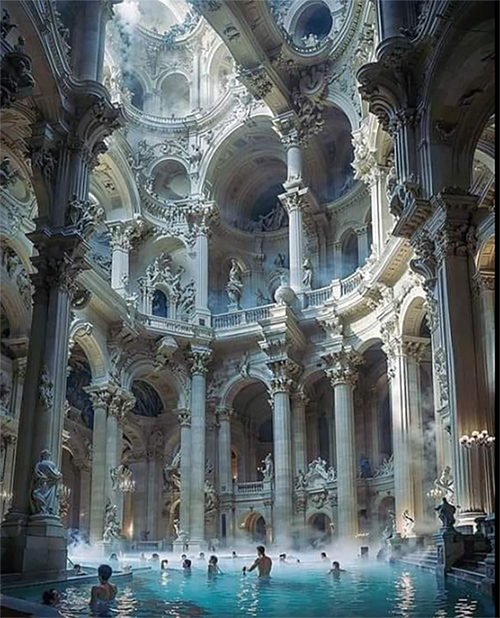
Artificial Intelligence helps recreate Baths of Caracalla. The Baths of Caracalla were built around the year 216 for the use and enjoyment of the Rom ...

Card image cap
70 beautiful doors that you'll love to see

[[-- NEWPAGE --]][[-- NEWPAGE --]][[-- NEWPAGE --]][[-- NEWPAGE --]][[-- NEWPAGE --]][[-- NEWPAGE --]][[-- NEWPAGE --]][[-- NEWPAGE --]][[-- NEWPAGE - ...

Card image cap
Villa in Mykonos, Greece

Villa in Mykonos, Greece - ⁣ on the shores of Mykonos.Design: @math.arqviz[[-- NEWPAGE --]]Villa in Mykonos, Greece - ⁣ on the shores of Mykonos.D ...

Card image cap
lofts

[[-- NEWPAGE --]][[-- NEWPAGE --]][[-- NEWPAGE --]][[-- NEWPAGE --]][[-- NEWPAGE --]][[-- NEWPAGE --]][[-- NEWPAGE --]][[-- NEWPAGE --]][[-- NEWPAGE - ...